
Analysis of Crime Trend in Seattle
Introduction:
This report presents a comprehensive analysis of crime distribution and trends in the city of Seattle for the years 2008 to 2022, emphasizing year 2022 to understand the present crime dynamics in Seattle, by utilizing a robust dataset obtained from the Seattle Police Department. The dataset is a rich amalgamation of information, detailing the types of offenses, the locations where they occurred, the times at which they took place, and other critical variables that give a multi-dimensional view of criminal activity within the city.
The objective of this analysis is to derive meaningful insights that can aid in the enhancement of public safety and the optimization of law enforcement resources. By dissecting the datasets, we aim to identify patterns in the prevalence of various types of crimes in multi-level areas, pinpoint neighborhoods that are disproportionately affected by criminal activities as well as the localization of crime.
Our approach involves a granular examination of the data to reveal the intricate dynamics of crime in Seattle. The spatial distribution that may suggest geographically concentrated pockets of high criminal activity that provide an understanding of the city’s crime landscape.
As we proceed, we will explore the methodology behind our analysis, present our findings in a series of visualizations and narratives, and conclude with recommendations based on our study. This report is not the culmination but a continuous effort towards understanding and reducing crime in Seattle.
Data Preparation:
The analysis utilizes crime data sourced from the Seattle Police Department spanning the years 2008 to 2022, available at https://data.seattle.gov/Public-Safety/SPD-Crime-Data-2008-Present/tazs-3rd5. The dataset encompasses a comprehensive array of information crucial for understanding and analyzing criminal activities. Each crime report is uniquely identified by a Report Number, facilitating tracking and reference, while the Offense ID serves as an added unique identifier for individual offenses. The temporal aspects of the offenses are detailed through Offense Start date and end date, providing insights into the duration of events.
The dataset obtained from SPD contained longitude and latitude coordinates which doesn’t provide any higher level meaning in terms of geographic crime pattern. These coordinates were transformed into Geometry point objects, then employing a spatial join technique, each point was linked to its respective Census Block using Seattle’s 2020 Census Block geometry data. Leveraging the hierarchical structure of Census Blocks and Tracts within larger areas, the data was further contextualized within Community Reporting Areas (CRAs) in Seattle. CRAs, resembling neighborhood and neighborhood districts, provide a localized community-level perspective, aligning with familiar terminology for Seattle residents. Additionally, Seattle’s neighborhoods and neighborhood districts are aligned with census tracts borders, ensuring a non-overlapping dataset for accuracy. Subsequently, a merger with “Selected Demographic and Housing Estimates (DP05)” data for the 2020 population was executed, contributing to a more nuanced analysis of normalization by population or by areas. This integrated approach offers valuable insights into the interplay between crime patterns and demographic factors, enhancing the overall understanding of the socio-economic landscape.
The rationale behind aggregating points into larger areas is twofold: it provides a summarized view of crime patterns in multi-level while retaining the localization of incidents. Additionally, employing familiar terms caters to the understanding and engagement of our Seattle audience.
Insights:
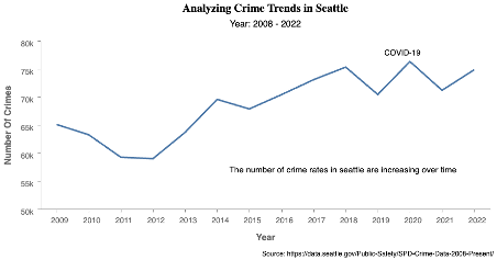
Annual Crime Statistics in Seattle from 2008 to 2022.
Goal:
The main goal of the graph is to examine the trend in crime rates from 2008 to 2022. Through this visualization, we seek to detect and comprehend any clear patterns or shifts in crime statistics.
Observations:
Over a span of 14 years, the crime statistics exhibit an overall upward trajectory. Notably, in 2011, there was a significant decrease in crime rates, but this was followed by a sharp escalation in 2012. The highest level of crime was recorded in 2014, after which there was a marginal decline. The year 2019 marked another, though less pronounced, decrease in crime. Interestingly, in 2020, coinciding with the onset of the Covid-19 pandemic, there was a surge in crime rates, reminiscent of the peak observed in 2014. The latest data from 2022 indicates a persistent rise in criminal activities, suggesting a need for in-depth analysis to uncover the driving factors behind this trend.
Justification of the graph:
The purpose of this graph is to visually depict the trend in crime incidents over the years from 2008 to 2022 in the dataset. The x-axis represents each individual year, while the y-axis quantifies the count of reported crimes. By utilizing a line chart, the graph allows for a clear and intuitive understanding of how the overall volume of crimes has changed over the specified time period. The upward or downward trajectory of the line provides a quick visual assessment of whether crime rates have increased, decreased, or remained relatively stable throughout the years. The chart’s simplicity and increased line thickness make it stand out with more clarity and make it an effective tool for communicating complex temporal patterns in crime data to a diverse audience.
We have also made strategic enhancements such as callout text to underscore crime trends. The modified y-axis ticks, where ‘k’ denotes thousands, streamline data readability. These refinements aim to improve the interpretative clarity of the graph, ensuring that the depiction of crime trends in Seattle for 2022 is both accurate and user-friendly.
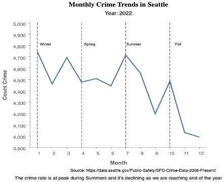
Monthly Crime Trends in Seattle for the Year 2022.
Goal:
The goal of the plot is to analyze and discern the pattern of crime incidents in Seattle throughout the recent complete year, 2022. This year is selected to reflect the current crime situation, providing a true representation of the fluctuations in crime rates by season helps in understanding the safety and security within the city.
Observation:
The graph illustrating crime counts in Seattle for the year 2022 reveals a distinct seasonal trend in criminal activity. The year begins with higher crime rates in the winter months, which then dip towards the end of the season. With the arrival of spring, there is a marked rise in crime, peaking notably in May. This peak could be attributed to various factors, such as increased outdoor activity during the milder weather. As summer commences, the data shows considerable fluctuation, with a significant downturn in July, which swiftly reverses into another peak in August, suggesting a possible connection to seasonal social dynamics or events. Following this, there is a sharp decline as autumn approaches, culminating in the lowest crime rates of the year towards the end of fall.
Justification of the graph:
This graph is designed to present the monthly crime count in Seattle for the year 2022. The x-axis represents the months of the year, while the y-axis quantifies the number of crimes reported each month. By deploying a line chart, the graph provides a straightforward visualization of the fluctuations in crime rate throughout the different seasons, which are annotated with vertical dash lines the year dividing into Winter, Spring, Summer, and Fall and description of those lines.
This contextual adjustment makes the data more relatable and easier to understand at a glance. The line chart effectively captures the ebb and flow of crime incidents, allowing viewers to quickly discern patterns and anomalies throughout the year, such as the significant dip in crime reports towards the year’s end. Caption is also added to convey the author’s observations which also enhance accessibility of the graph to cater screen readers.
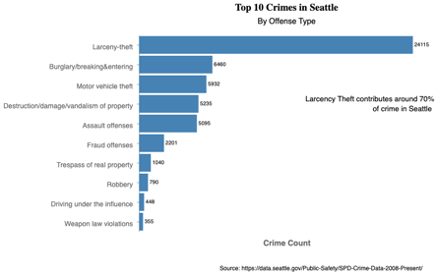
Top 10 Crimes in Seattle by offense types
Goal:
The goal of creating this graph is to present a clear and quantifiable comparison of the top 10 criminal types in Seattle, highlighting which types of crimes are most prevalent.
Observation:
The bar chart displays the top 10 offenses in Seattle, categorizing them by type and indicating their frequency. The most common offense, by a significant margin, is larceny-theft, followed by burglary/breaking & entering, and motor vehicle theft. These top three categories suggest that property crimes are a major concern in the area. Destruction/damage/vandalism and assault offenses also feature prominently, indicating further areas of concern for public safety. Notably, offenses such as fraud, trespassing of real property, and robbery occur with less frequency but are still significant enough to be included in the top 10.
Justification of the graph:
The horizontal bar chart presents the top 10 offenses in Seattle, categorizing each crime type along the y-axis and quantifying their occurrences on the x-axis. This format is effective for comparing different categories, allowing for a clear and immediate visual distinction between the frequencies of each offense. The observation is also been translated into text encodings, showcase the top crime type and some statistical information for deeper context. The horizontal bar chart’s effectiveness is further enhanced by a formatting change: transforming the y-axis labels from all caps to only capitalizing the initial letter of each crime type. This alteration not only conforms to standard writing practices, making the chart appear more professional, but also improves legibility, which is particularly beneficial when quickly scanning through the data.
The horizontal orientation of the bar chart is deliberately chosen to align with natural eye movement patterns and to reduce cognitive load for the viewer. This design choice, coupled with a lower ink-to-data ratio achieved by omitting the x-axis and tick labels and placing values directly next to the bars, streamlines the presentation of data. These considerations ensure the graph is intuitive and enhances the audience’s ability to quickly interpret the crime data.
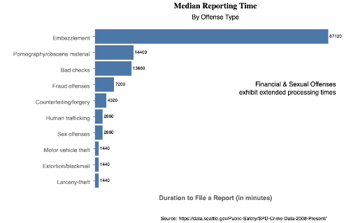
Median Reporting Times for Different Types of Crimes
Goal:
The motivation for creating this graph is to analyze and compare the median reporting times for various crime types.
Observation:
The bar chart clearly indicates that certain types of crimes, such as embezzlement and offenses related to pornography or obscene material, tend to have a longer median reporting time compared to others, like motor vehicle theft or larceny-theft, which are reported more promptly. Embezzlement tops the list, suggesting a longer time for detection or reporting, while larceny-theft, extortion/blackmail, and motor vehicle theft are at the lower end, indicating quicker reporting times.
This discrepancy in reporting times could stem from several factors. Crimes with a direct and immediate impact, such as theft, may be noticed and reported more quickly. In contrast, crimes like embezzlement or fraud might only come to light after a detailed audit or investigation, hence the longer reporting time. The immediate social or personal impact of a crime could also influence reporting times; for example, the stigma associated with sex offenses might lead to delayed reporting.
Justification of the graph:
The plot provided, titled “Median Reporting Times”, follows by subtitle “by Offense types” offers the context of the visual. The bar chart effectively conveys median reporting times for different crime types, with horizontal bars facilitating a clear comparison across categories. The chart’s straightforward layout, with crime types on the y-axis and median times on the x-axis, ensures legibility. The inclusion of precise numerical values at the end of each bar is a valuable feature for detailed analysis. Also, text callout is employed to deliver the author’s observations.
Comparison of Assault and Burglary Across Micro Communities
Goal:
The goal of plotting the graph is to provide a comparative visual analysis of the frequency of assault offenses and burglary/breaking & entering incidents across various neighborhoods. By mapping these two specific crime types in a scatter plot, it allows for an immediate visual assessment of which neighborhoods are more prone to certain crimes.
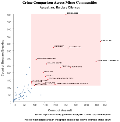
Observation:
From the plot, neighborhoods such as Queen Anne and Capitol Hill stand out with a high number of both assault offenses and burglaries, signaling them as potential hotspots for criminal activity. Conversely, neighborhoods with points clustered towards the origin of the axes exhibit lower frequencies of these crimes.
Justification of the graph:
The scatter plot visualizes the relationship between assault offenses and burglaries/breaking & entering incidents in various Seattle neighborhoods. The x-axis represents the number of assault offenses, while the y-axis measures the occurrences of burglaries/breaking & entering, with each point indicating a specific neighborhood.
The plot effectively uses a two-dimensional plane to allow for an immediate visual assessment of how neighborhoods compare in terms of these two crime rates. The color-coded points enhance readability, and the gradient red background is intended to highlight areas with above average incidences of the respective crimes happening. Which we have also commented on as a caption in the plot.
Geographic Distribution of Crime Rates in Seattle Neighborhoods
Goal:
The goal of the plot appears to be to visually represent the frequency of crime incidents across different neighborhoods in Seattle.
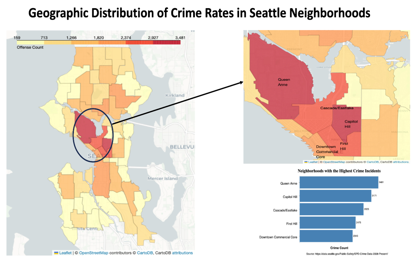
Observation:
Neighborhoods with the highest crime count are: Queen Anne and Capitol Hill. Some of their surrounding neighborhoods are also on top of the list, like Cascade/Eastlake, Downtown and First Hill, while North Capitol Hill and Miller Park have the lowest crime incidents. However, this visual might not fairly compare neighborhoods since they have different demographic and differs in sizes.
Justification of the graph:
The visual presentation comprises three distinct components. On the left side, a main choropleth map of Seattle utilizes a color theme from light yellow to red, employing shades to convey higher value points, with red indicating the highest crime count. The map, titled “Geographic distribution of crime in Seattle neighborhood,” avoids overcrowding by not incorporating neighborhood names or crime counts directly on the map. To compensate for this lack of detail, the right side of the graph features an image callout of the choropleth map, offering a higher zoom into areas with the highest crime counts. Text encodings at the top of this image callout provide the names of highlighted neighborhoods for audience reference. Simultaneously, these highlighted neighborhoods are depicted in a horizontal bar chart at the bottom right, presenting the natural order and exact numerical values. While acknowledging that cross-referencing across the three maps may be less effective, consolidating detailed information into a single map is avoided to prevent visual noise and overlapping, ensuring an expressive conveyance of the intended message.
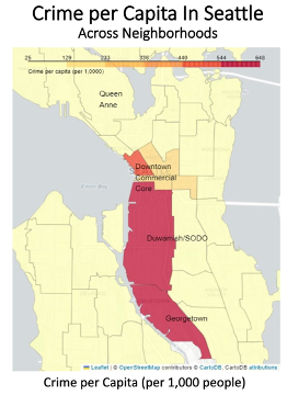
Crime Density Per Square Miles In Seattle
Goal:
Acknowledging the limit of graph 6, the report normalizes the crime frequency with population, using crime rate per capita (per 1000) as a new metrics to compare between neighborhoods.
Observation:
While Queen Anne being highest with crime frequency, the normalization by population reveals that the industrial side of town, SODO and Georgetown contains higher crime per capita (per 1000 residents)
Justification of the graph:
The map itself is another choropleth map, which we have already justified for its effectiveness above. In this map, we put the neighborhood name with the highest crime per capita into the map without any bar charts on a side, reducing the cognitive load of cross-referencing, with value, but only to grab the names of neighborhood on the top 3 and some related neighborhood that is high on other metrics (Queen Anne).
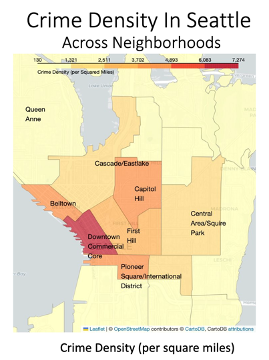
Crime Per Thousand Capita In Seattle
Goal:
Continuing the series of metrics to for neighborhood comparison from graph 6 and 7, graph 8 introduces normalization by areas to compute Crime density (per square miles).
Observation:
The highest crime density (per square miles) neighborhoods are Downtown, Capitol Hill, Belltown, and Pioneer Square/International District. While Queen Anne has highest with crime frequency, it is the lowest on other metrics like crime per capita or crime density. Justification of the graph: The map itself is another choropleth map, which we have already justified for its effectiveness above. In this map, we put the neighborhood name with the highest crime per capita into the map without any bar charts on a side, reducing the cognitive load of cross-referencing, with value, but only to grab the names of neighborhood on the top 3 and some related neighborhood that is high on other metrics (Queen Anne).
Correlation Between Population Density and Crime Count in Seattle.
Goal:
The goal of the plot is to analyze and illustrate the relationship between population density and the crime count within various neighborhoods in Seattle. It aims to determine if a higher population density correlates with a higher number of reported crimes.
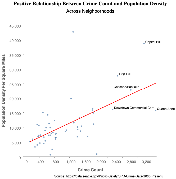
Observation:
There is a potential relationship between population density and crime count in Seattle neighborhoods, which are positive.
Justification of the graph:
The scatter plot proves to be a useful instrument for illustrating the potential correlation between population density and crime counts in Seattle neighborhoods. Placing population density and crime counts as variables on the coordinates, the graph utilizes point geometry to visually represent their corresponding values. To facilitate audience comprehension of the relationship, a red regression line is incorporated, contrasting with the blue points. Additionally, to maintain consistency and relevance with previous graphs, text encodings are included next to the points, highlighting the top 5 neighborhoods in terms of crime count. This cohesive approach enhances the audience’s understanding of the data by providing a clear visual representation of the relationships between population density, crime counts, and the notable neighborhoods. The objective of the graph is to illustrate the correlation between population density and crime count. To achieve this goal, the graph employs two coordinate axes to represent these quantitative variables. Additionally, a regression line is incorporated into the graph to highlight a potential linear relationship between the two variables. The statistical data utilized in this graph is derived from the neighborhood level, a detail emphasized in the title and certain text encodings. To provide context, the graph features text encodings displaying the five neighborhoods with the highest crime counts. These text elements are strategically positioned to avoid overlap with the regression line, ensuring clarity in the presentation of both statistical trends and specific neighborhood information. The combination of visual elements and informative text contributes to a comprehensive depiction of the relationship between population density and crime count at the neighborhood level.
Downtown Crime Count Distribution
Goal:
Analyzing the earlier graphs reveals that downtown areas rank highest in terms of identified regions with high crime rates, whether assessed through high-crime areas, per capita analysis, or per square mile analysis. Hence, this visualization will help in exploring the specific blocks contributing to crime in the downtown area.
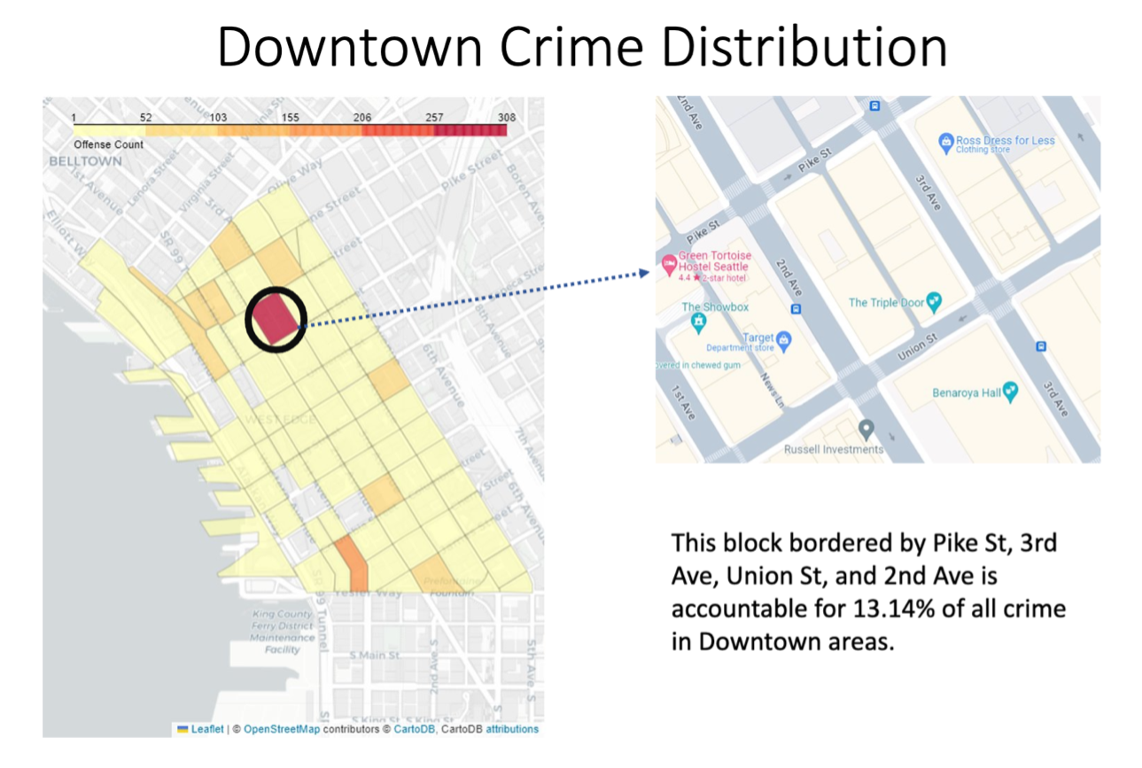
Observation:
In graph 9, the block bordered by Pike St, 3rd Ave, Union St, and 2nd Ave is with highest shade of red, while the surrounding areas are paler in color. This spot alone is accountable for 308 crime incidents in 2022, 13.14% of all incidents in Downtown neighborhood.
Justification for the graph:
The choropleth map depicted is a visualization of crime density within various blocks of a Downtown area. It uses a consistent color theme with the above choropleth maps with all their explained effectiveness. The map also includes image callout and text callout. Incorporating both image and text callouts serves a dual purpose in enhancing map comprehension for the audience. Image callouts visually delineate the precise borders of the blocks, providing a concrete representation of their geographical extent where block identification (name) is not useful. This visual aid ensures audience clarity regarding the real-life location of each block. Simultaneously, text callouts articulate the block borders in words and statistical information, which is the percentage of the crime count in this block in relation to the overall neighborhood, adds a layer of significance. This statistic aids audiences in understanding the block’s relative importance within the broader context of the neighborhood.
Conclusion:
In conclusion, the comprehensive analysis of Seattle’s crime trends from 2008 to 2022, with an emphasis on the year 2022, has uncovered critical insights into the city’s public safety landscape. We observed a general upward trajectory in crime rates over the years, with specific peaks and fluctuations pointing to the dynamic nature of criminal activity. The data revealed that property crimes such as larceny-theft, burglary, and motor vehicle theft are predominant, highlighting the need for focused law enforcement strategies in these areas. The neighborhood-specific analysis showed that areas like Queen Anne and Capitol Hill are particularly affected by crimes like assault and burglary, indicating the necessity for targeted interventions in these regions. The study also brought to light the varying reporting times for different crimes, suggesting the need for diverse investigative approaches.
Moreover, the geographical distribution and density analysis revealed that while some neighborhoods have high crime counts, others exhibit higher crime rates per capita or per square mile, necessitating area-specific crime prevention methods. The correlation between population density and crime count underscores the challenges faced by more densely populated areas. The multi-level geographical analysis has brought to light the intricate micro-level patterns of crime within Seattle. Despite Downtown exhibiting the highest overall crime rate among the neighborhoods, a closer examination reveals that within this larger area, certain smaller blocks stand out for their concentration of criminal incidents. This nuanced understanding underscores the importance of drilling down to finer geographic units, such as individual blocks, to capture localized variations in crime distribution. Overall, this analysis emphasizes the importance of a multifaceted approach in understanding and tackling crime in Seattle, underscoring the need for continuous monitoring and adaptation of public safety strategies to evolving crime patterns.
References:
Seattle Police Department Crime Data: https://data.seattle.gov/Public-Safety/SPD-Crime-Data-2008-Present/tazs-3rd5
Seattle Geographic Data: https://data-seattlecitygis.opendata.arcgis.com/datasets/SeattleCityGIS::selected-demographic-and-housing-estimates-dp05/explore
Seattle GIS: https://data-seattlecitygis.opendata.arcgis.com/datasets/SeattleCityGIS::community-reporting-areas-3/about
Seattle Census Dataset: https://data.seattle.gov/dataset/2020-Census-Blocks-Seattle/rg9f-z788/data