
Analysis of Greatest 500 Songs Of All Time
Table of contents
Introduction
In this analysis, we will explore the top 500 greatest songs of all time, as curated by Rolling Stone magazine. This dataset provides an intriguing opportunity to examine the popularity of songs from the past and observe how the musical landscape has transformed over the years. The analysis aims to shed light on the changing trends in music, highlight renowned artists, and offer insights into the historical context of these influential songs. Through this exploration, we hope to provide a deeper understanding of the evolution of musical preferences and the artists who have left a lasting impact on the industry.
About Dataset
Context
Rolling Stone is an American monthly magazine that focuses on popular culture. It was founded in San Francisco, California, in 1967 by Jann Wenner, and the music critic Ralph J. Gleason. And here are their top 500 picks as the greatest songs of all time.
Content
The dataset includes 500 songs with attributes such as title, description, artist, etc.
Acknowledgements
The data is taken from Kaggle: (https://www.kaggle.com/datasets/omarhanyy/500-greatest-songs-of-all-time)
Exploratory Data Analysis
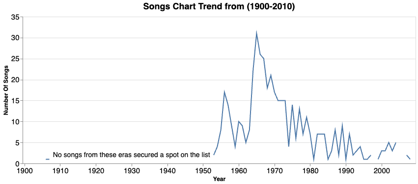
Let’s examine the decades in which songs were released and analyze the trends. Which era saw the greatest prominence of songs, and in which decade did songs make a lasting impact?
Observations:
- No songs from the period 1910 to 1950 made it to the list of Rolling Stone’s greatest songs. Investigating the possible reasons behind this could be an intriguing topic for future exploration.
- Notably, there is a peak in the number of songs during the mid-1960s. Further investigation will be conducted to uncover the factors contributing to this peak.
- It’s noteworthy that there are very few songs from the 2000s on the list. This observation raises concerns as it may suggest a decline in the music industry during that era.
Design Choice:
- Used a line graph to illustrate the trend over the years, aiding in the visualization of the number of songs released in each decade.
- The x-axis labels are strategically spaced, revealing only the decade on the graph for better clarity.
- Both the x and y-axis labels are presented clearly, facilitating easy interpretation of the chart.
- The text specifying that no songs from that era made it to the charts is straightforward and effectively communicates the absence of entries from that particular time frame on the list. This enhances the informational value of the graph.
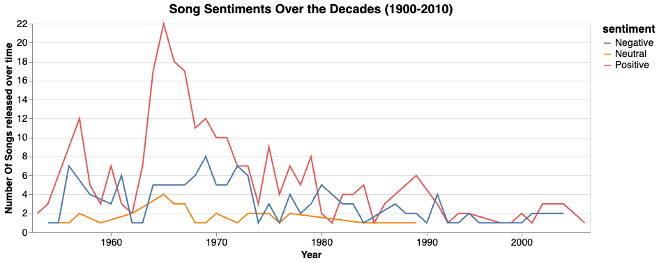
Let’s explore the sentiment of songs released between 1960 and 2010, as this analysis offers valuable insights into the changing public perceptions and attitudes toward music. Notably, no songs from earlier years made it to the list, making this period the focus of the examination.
Observations:
- The count of neutral songs is lower compared to both positive and negative sentiments in the dataset.
- While positive and negative songs exhibit a similar trend, it is evident that positive songs are more favored by listeners, which is a positive indicator.
Design Choice:
- Used a line graph to depict the trend over the years, incorporating Sentiment as color encoding. This approach enables the simultaneous visualization of these sentiments on a single graph.
- The x-axis labels are thoughtfully spaced to display only the decade, enhancing clarity in interpretation.
- Clear presentation of both x and y-axis labels ensures easy understanding of the chart.
- The legend size is sufficiently large, ensuring easy readability of the title.
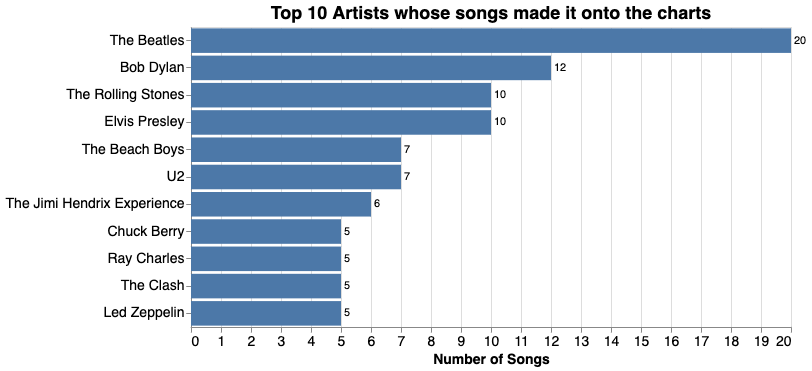
Now, let’s identify the top 10 artists whose songs have secured a spot on the charts.
Observations:
- The songs of The Beatles have appeared on the charts 20 times. Following closely are Bob Dylan, Rolling Stones, and Elvis Presley.
Design Choice:
- Utilized a bar graph to display the count, strategically placing the song count along the bars to reduce eye movement and cognitive load for the audience.
- The graph maintains a clear presentation with both x and y-axis labels for easy understanding, and the y-axis label has been omitted from the graph as it is conveyed in the title.
The songs of The Beatles have notably frequented the charts numerous times. It’s crucial to examine the trend of this occurrence over time. 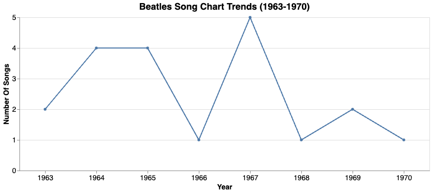
Observations:
- It’s evident that the majority of The Beatles’ songs were released between 1963 and 1970. The peak observed in the mid-1960s on the song trend graph is largely attributed to The Beatles’ songs.
- Specifically, The Beatles’ songs gained significant popularity in 1967.
Design Choice:
- The graph is designed for easy readability, with clear titles and labels. Used line plot in this case to show the trend over the years.(My go-to graph for trends over time. :P)
- Points on the graph are highlighted for emphasis.
- Y-axis labels are formatted to omit decimal numbers, enhancing visual clarity.
Let’s explore the streaks of charted songs over the years and examine their distribution.
Note: Streaks by weeks refers to the consecutive number of weeks during which a song maintains its position on the charts.
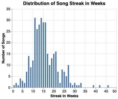
Observation:
- The majority of songs have sustained streaks ranging from 12 to 20 weeks, equivalent to approximately 3-4 months.
- A few exceptional songs have maintained streaks exceeding 30 weeks, sparking interest in further exploration.
Design Choice:
- Used a histogram to illustrate the distribution of streaks in weeks.
- Ensured proper sizing of the title and labels for clear visibility.
Let’s identify the names, artists, and streak lengths of songs that have maintained streaks longer than 30 weeks. 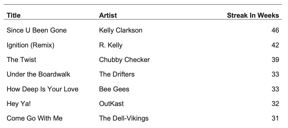
The song “Since U Been Gone” sustained a streak of almost 46 weeks, nearly equivalent to a year.
Now, let’s shift our attention to find the words used in song titles.
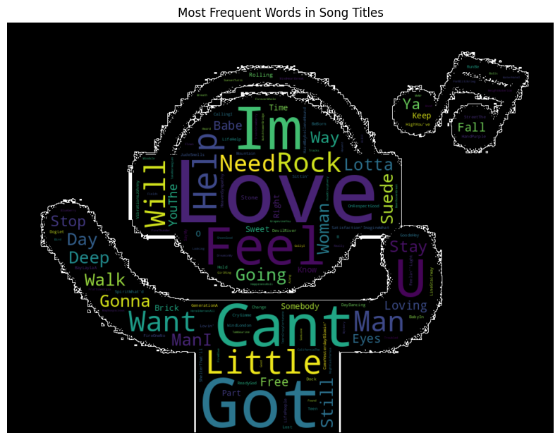
- Words like Love, Feel, Can’t, Need, Want, and Talk are frequently used in song titles.
Design Choice:
- The title conveys the words used in to plot the word cloud.
- Opting for a black background significantly improves text visibility.
- Moreover, adding an icon that combines a human face with a music symbol introduces a visually appealing element. Observing the icon’s enjoyment of the music further reinforces the theme of great songs.
- Added a white-colored outline around the word cloud to highlight its shape.